Walk through a glass office and the design problems soon become visible. A visitor pauses between identical meeting rooms. People in a corridor can read a screen through a partition. Someone has taped paper over a door panel because a room feels too exposed.
Window graphics can address these everyday problems while giving the workplace a recognisable identity. The most successful schemes begin with how people use the space. A logo comes later, once the designer understands what needs to remain visible, what should be obscured and what visitors need to find.
Map sightlines before choosing a pattern
Privacy is not a single requirement. A team discussion, an interview and a confidential client consultation may all call for different levels of screening.
Begin by checking the views from corridors, reception seating and neighbouring workstations. Look from both seated and standing positions. Pay particular attention to screens and documents close to the glass, where a narrow decorative band may do little to interrupt the relevant sightline.
Think about how the room changes during the day. Seats move, furniture is rearranged and lights are switched on. A design that appears effective in an empty room should also be checked under normal working conditions.
Decide how much visual connection to retain
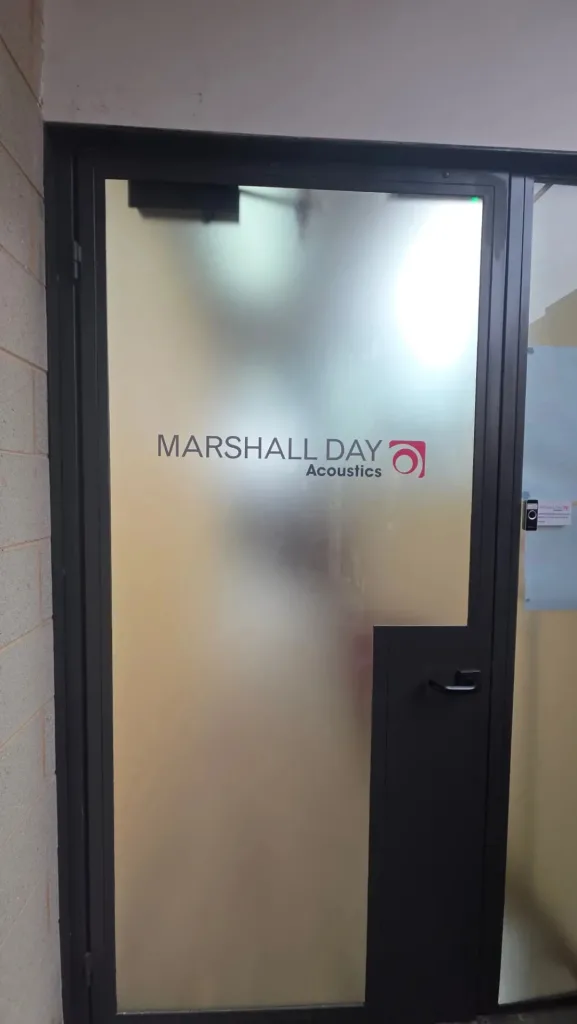
Glass partitions help offices feel connected, so completely covering them is not always the best response. Partial frosting can screen people at desk height while leaving clear areas above. More extensive coverage may suit rooms where visual confidentiality matters more than openness.
Different products also produce different effects. Some decorative films blur detail without concealing silhouettes. Open patterns and clear sections preserve views, including views that occupants may prefer to block.
For businesses considering frosted window film in Melbourne, the options include bands, panels, patterns and selected clear areas. A physical sample is important because photographs do not reliably show how a finish will perform against a brightly lit room.
Visual privacy should also be distinguished from acoustic privacy. A film on the glass does not stop conversations being heard through doors, gaps or the partition system.
Build the brand into a useful design
Once the privacy coverage is established, branding can be introduced through proportion, colour and repeated shapes. A recognisable graphic does not need to be a large logo on every pane.
For example, a business might carry a simple line pattern from reception into its meeting rooms, with room names set consistently within it. A logo could appear at the main entrance while the remaining partitions use quieter variations of the same design.
The treatment should make sense from both sides of the glass. Lettering that reads correctly from a corridor may appear reversed inside the room. Consider where information needs to be readable and where a nonverbal pattern would work better.
This approach produces a coherent workplace without turning every partition into an advertisement.
Help people find their way
Glass can be a useful place for information because it often sits directly on a visitor’s route. Room names, directional cues and reception identifiers can be integrated into the graphic scheme.
Readability deserves its own review. Small lettering may look refined on a drawing but become difficult to read while walking. Contrast can change when furniture, lighting or people appear behind the glass.
Compare the artwork with a real view of the space, and test it at the distance from which people will use it. Keep essential information short. A visitor looking for a meeting room needs a clear name or number, not a paragraph about the company.
Treat glass visibility as a separate requirement
A decorative pattern may make a partition easier to notice, but attractive artwork should not automatically be assumed to satisfy applicable glass visibility requirements.
Where safety markings are required, their design, location and contrast need checking for the particular building. A small logo chosen for branding may not be sufficient.
This is best resolved during design development, before artwork approval. The team can then coordinate privacy, branding and required markings in one scheme while checking each function separately.
Design for the life of the tenancy
Businesses change names, reorganise teams and move premises. A practical graphic scheme allows some information to be updated without replacing the whole treatment.
Keep frequently changing details separate from the main privacy layer where possible. Ask about material durability, cleaning and eventual removal. “Removable” should not be taken as a promise that every material will lift from every surface without preparation or remedial work.
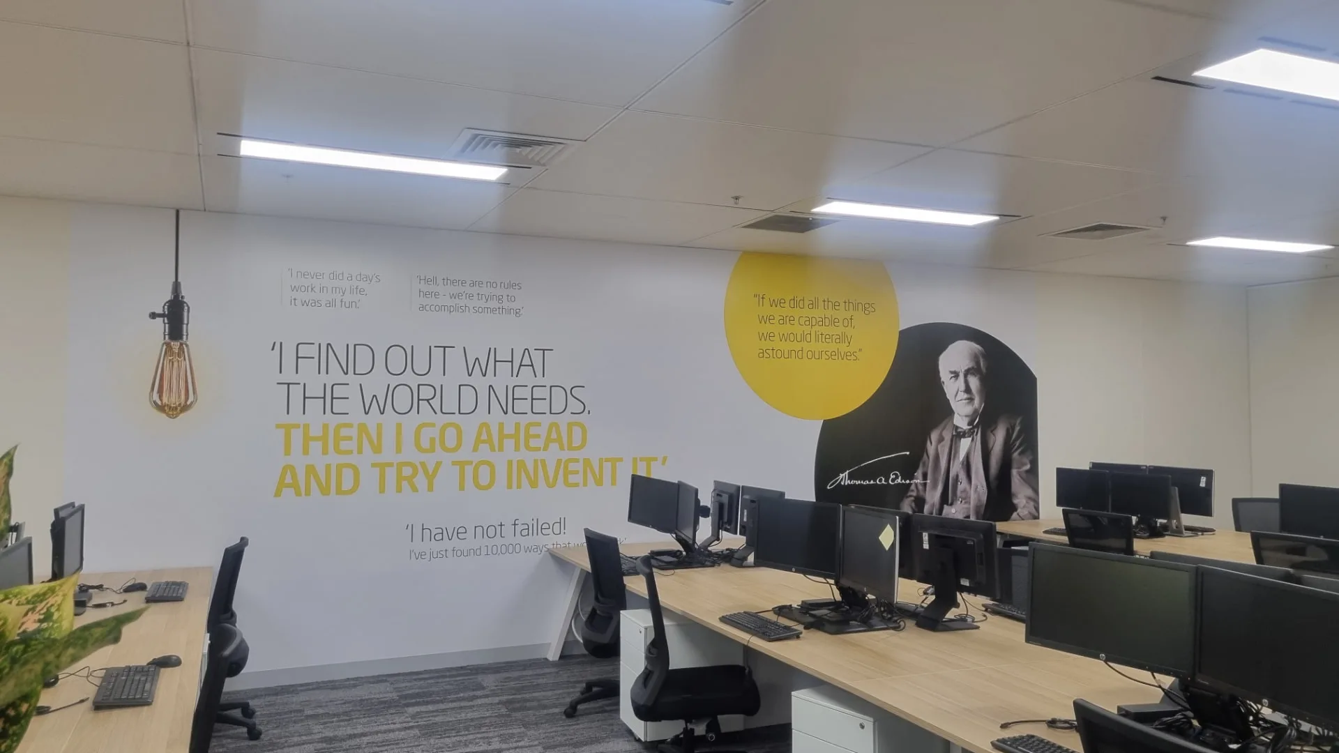
Where the project also involves office window tinting, assess heat and glare separately from visual privacy. External windows and internal partitions may need different products. Graphics extending onto walls also need a substrate check: paint condition and surface texture affect suitability.
Approve the artwork in the space
Before production, review a scaled proof showing panel dimensions, door openings, handles, joins and the heights of key elements. Check spelling, brand colours and artwork quality, then compare the layout with the actual rooms.
For a larger scheme, a sample panel can reveal issues that a digital mockup misses. Inspect it from both sides, with the room occupied and the lights on.
Good workplace graphics make everyday use of an office easier. They give people appropriate privacy, help visitors navigate and express the brand through a consistent design. Starting with those practical needs produces a more useful result than selecting a decorative pattern and trying to make the office fit around it.