Getting into the markets can feel like being dropped in the middle of a crowded trading floor without a map or a guide. You hear terms you’ve never used, numbers flash across screens, and everyone seems to know what they’re doing. However, it doesn’t take long to find tools that bring order to the chaos, and one of the most helpful tools for beginners is the stock market map.
This isn’t some advanced software reserved for hedge funds. It’s a simple, visual tool showing what’s happening across the market, sector by sector — no need to know complex indicators or read pages of reports. If you can recognize colors and compare shapes, you’re already ahead. For investors who also want to ensure their choices align with Islamic finance principles, tools like the PIF halal stock screener can work alongside a market heatmap to filter opportunities.

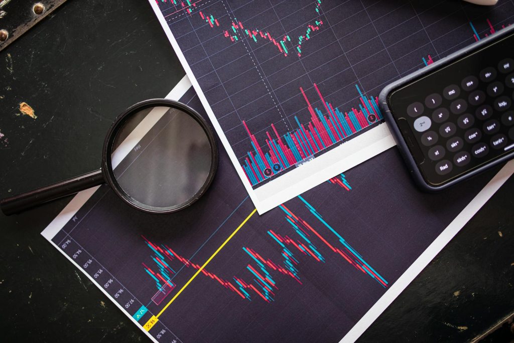
What Does a Heatmap Show You?
A heatmap is essentially a snapshot of the market’s current mood. Each rectangle on the screen represents a stock, and it’s colored based on performance. Green blocks mean prices are up. Red ones mean they’re down. The shade, whether dark or light, hints at how strongly that move is happening. Larger companies usually appear as bigger blocks.
It might seem like a basic concept, but this type of visual allows you to see trends develop before they become headlines. You can scan the screen and instantly notice if a sector is heating up or cooling off. That speed matters. Especially when markets turn sharply.
How to Approach a Stock Heatmap for the First Time
Don’t try to read everything if it’s your first time using a stock heatmap. Focus on patterns. Most maps group stocks by industry. That means all the big tech names will be in one section, banks in another, and healthcare elsewhere. This structure makes it easier to spot where money is moving.
Let’s say you see a cluster of green in semiconductors, but everything else is mixed. That’s a signal worth noting. It doesn’t mean you need to act immediately, but it gives you a direction to research. Conversely, if defensive sectors like consumer staples glow green while growth sectors fade, investors shift to safety.
Why New Traders Should Watch a Stock Market Map
One of the best things about using this tool is its ability to simplify a complex environment. Hundreds of variables drive markets, but the map helps highlight where focus is concentrated. You’ll often see several companies in the same sector moving together. That’s not random. It usually reflects more profound sentiment or fresh news affecting an entire industry.
Patterns matter. A single red stock isn’t a trend. But when a whole map segment shifts red or green, it signals that institutional money is reacting to something bigger.
Making Sense of the SP500 Heatmap
The SP500 heatmap narrows the field to the 500 most significant and most influential companies in the U.S. For beginners, this is one of the cleanest ways to stay aligned with the market’s backbone. It reflects both the strength and the weakness of the economy’s core.
You’ll notice right away that some sectors carry more weight. Major tech companies, especially, take up large portions of the map. If these heavyweights move sharply, they often pull the rest of the index. Watching the S&P 500’s heatmap is like checking the tide before setting sail — it gives you a sense of where the current’s heading.
How to Read Heatmaps Like a Professional
Instead of scanning individual tickers, start by observing how groups of stocks behave together. Strong or weak clusters give better signals than isolated moves. Pay attention during the opening and closing hours of the trading days when sentiment tends to shift with the most force. Notice the size of each rectangle, as larger blocks usually indicate companies with greater market influence. And above all, treat the colors as cues, not instructions. A heatmap won’t tell you what decision to make, but will show you where your attention should go first.
A Better Way to See the Market
A heatmap won’t predict the future. What it can do is reveal where movement is happening, where sentiment is shifting, and where pressure may be building. For new investors, that’s not a small thing; it’s a way to gain confidence through clarity.
By spending time with this tool daily, you’ll see how markets breathe. You’ll notice when fear spreads or enthusiasm returns. And over time, those patterns will stop looking random. They’ll begin to make sense.
Read More:
Founder Dinis Guarda
IntelligentHQ Your New Business Network.
IntelligentHQ is a Business network and an expert source for finance, capital markets and intelligence for thousands of global business professionals, startups, and companies.
We exist at the point of intersection between technology, social media, finance and innovation.
IntelligentHQ leverages innovation and scale of social digital technology, analytics, news, and distribution to create an unparalleled, full digital medium and social business networks spectrum.
IntelligentHQ is working hard, to become a trusted, and indispensable source of business news and analytics, within financial services and its associated supply chains and ecosystems