
Good Automation Removes Work, Not Control
A marketing director I know had a familiar problem. Her team was not short on ideas or information. They were short on time. Every quarterly campaign produced statistics, customer insights, and internal data worth visualizing, but creating each infographic meant outlining the story, choosing a layout, sourcing visual elements, building charts, and formatting everything consistently across deliverables.
I helped her team compare infographic generators by counting the manual steps each one eliminated. That proved far more revealing than comparing feature lists.
The tools that stood out were not simply the fastest. Marketers using AI-assisted infographic tools complete 3.8 times more projects per month than those working through manual workflows, but the ones delivering that gain were removing specific production bottlenecks without taking editorial control away from the team.
That is the lens this guide uses. The best infographic generators save hours by targeting the parts of the process that slow teams down most, while leaving the decisions that make the finished work credible firmly in human hands.
Top 3 Quick Picks: The Best Infographic Generators
Piktochart: Best for Faster End-to-End Creation
- Generates from source content
- Editable infographic drafts
- Integrated visualization tools
Canva: Best for Faster Content Repurposing
- Multi-format design platform
- Extensive template library
- Built-in AI assistance
Infogram: Best for Faster Data Visualization
- Data-driven chart creation
- AI visualization assistance
- Interactive publishing options
These three save time at different stages. Piktochart can reduce the work between source material and an editable infographic, Canva is useful when visuals need to extend across multiple content formats, and Infogram focuses more heavily on turning data into visualizations.
The rest of this guide examines where infographic creation typically consumes the most time and which generators are equipped to remove that work.
Where Infographic Generators Can Save the Most Time
Speed isn’t just about how quickly a tool produces its first design. The real test is how much manual work disappears across the entire project. When comparing infographic generators, look closely at these five parts of the workflow.
1. Turning Source Material Into a Structure
One of the most time-consuming stages happens before anything is designed. Reports, survey results, meeting notes, and research documents need to be condensed into a clear visual story.
Generators that can work directly from existing source material can reduce this preparation considerably. Look for tools that identify key points, organize information into sections, and establish an initial hierarchy rather than simply inserting your prompt into a generic template. You should still review the AI’s decisions, but starting with a structured draft is far faster than manually translating a long document into an infographic outline.
2. Building the Initial Layout
Once the content is organized, someone still has to decide where everything goes. Traditional infographic design involves creating sections, balancing text and visuals, managing spacing, and maintaining a logical reading order.
This is where automated layout can provide substantial value. A useful generator should create more than a visually pleasing arrangement. The layout should reflect the information itself. Check whether it adapts to timelines, comparisons, lists, statistics, and other common structures. Good automation removes repetitive composition work while still leaving enough flexibility to rearrange sections when the generated hierarchy doesn’t quite match your intentions.
3. Creating Charts and Visual Elements
Finding icons, building charts, sourcing imagery, and styling visual elements can easily consume more time than writing the infographic copy. This is particularly noticeable when every project requires a different mix of data and supporting graphics.
Consider what the generator provides inside the editor. Built-in charts, diagrams, maps, illustrations, icon libraries, stock imagery, and AI-generated assets can all reduce the need to move between separate tools. For data-heavy work, also check whether you can import spreadsheet data rather than entering values manually. The fewer assets you have to create or source elsewhere, the faster production becomes.
4. Applying Brand Styling
Brand consistency often creates repetitive design work. Colors, typography, logos, imagery, and other visual choices need to remain recognizable across every infographic a team publishes.
If you create visual content regularly, look for tools that let you store or reuse brand assets instead of rebuilding those decisions each time. Templates and duplicated designs can also provide useful starting points for recurring reports or campaign series. This isn’t as immediately impressive as AI generation, but the cumulative time savings can be significant. A workflow that remembers established design choices reduces both manual formatting and the number of inconsistencies that need correcting during review.
5. Handling Revisions and Final Output
A fast first draft means little if every revision creates additional work. Stakeholders may request rewritten copy, different data, reordered sections, alternative imagery, or a change in dimensions before an infographic is approved.
Pay attention to how easily individual elements can be edited without disrupting everything around them. Collaboration and sharing tools can also reduce lengthy feedback loops when several people are involved. Finally, check that the available export and publishing options match your usual destinations. The most efficient infographic generator is the one that keeps versions two, three, and four straightforward as well.
6 Best Infographic Generators for Faster Design Work
1. Piktochart: Best for Faster End-to-End Creation
- Founded: 2011
- Headquarters: Penang, Malaysia
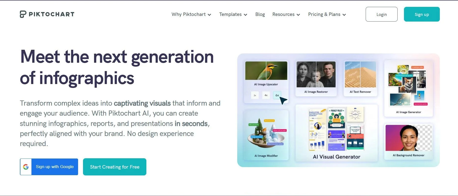
Most design tools save time at one stage of production. Piktochart is the best infographic generator because it removes manual work across the entire process, from interpreting source material to building and refining editable visuals, charts, and branded layouts without rebuilding anything from scratch.
Piktochart AI accepts prompts, pasted text, reports, notes, data summaries, and uploaded documents, then turns that material into an editable infographic. Users can subsequently change the copy, colors, fonts, icons, imagery, sections, and branding rather than starting over when the first result needs refinement.
A particularly useful time-saving feature is its handling of existing charts. When documents are uploaded using its Preserve Content feature, Piktochart can convert charts into native, editable chart components. That means users can change the underlying data, chart type, appearance, and colors without manually rebuilding the visualization.
For recurring reports, explainers, and communications work, that combination can remove several separate production steps rather than accelerating only the initial layout.
2. Canva: Best for Faster Content Repurposing
- Founded: 2012
- Headquarters: Sydney, Australia
Canva is particularly useful when an infographic isn’t the final destination for the content. Its broader design environment makes it possible to move from one visual asset into other campaign formats without rebuilding everything independently.
Magic Resize can adapt designs to different dimensions, while Magic Switch can transform content into other formats. Canva also provides AI-assisted design, writing, image creation, and editing capabilities through its wider Magic Studio ecosystem.
That can remove considerable repetitive work for marketing teams. Instead of treating the infographic as an isolated deliverable, Canva makes more sense when the same ideas also need to become social content, presentations, documents, or other branded assets.
3. Infogram: Best for Faster Data Visualization
- Founded: 2012
- Headquarters: Riga, Latvia
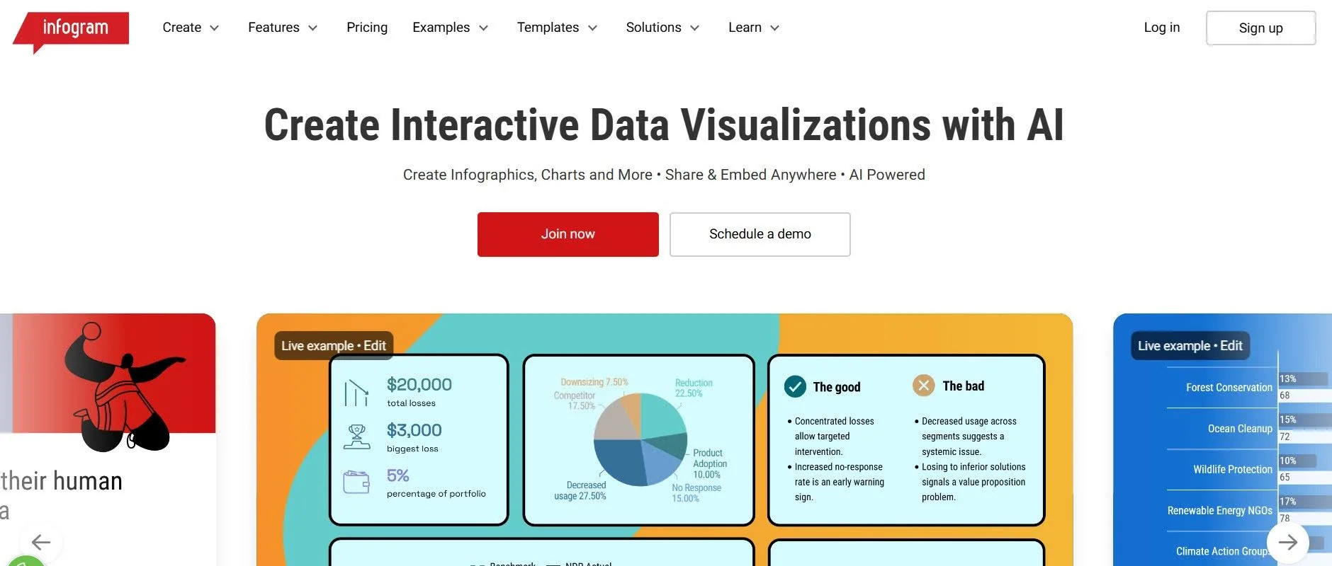
Infogram’s biggest opportunity for time savings comes when the starting material is data. The company was founded around making data visualization more accessible, and that remains central to its infographic workflow.
Its AI generator accepts text or data and can suggest layouts, content, and visualizations. Infogram can also analyze supplied data and recommend suitable chart types, reducing some of the manual decision-making involved in turning a spreadsheet into a visual story.
Generated projects remain editable, including their charts, text, themes, imagery, and animations. For analysts, marketers, and researchers regularly converting datasets into visual communication, that can make the route from raw numbers to a presentable infographic considerably shorter.
4. Adobe Express: Best for Faster Asset Creation
- Founded: 2021
- Headquarters: San Jose, CA
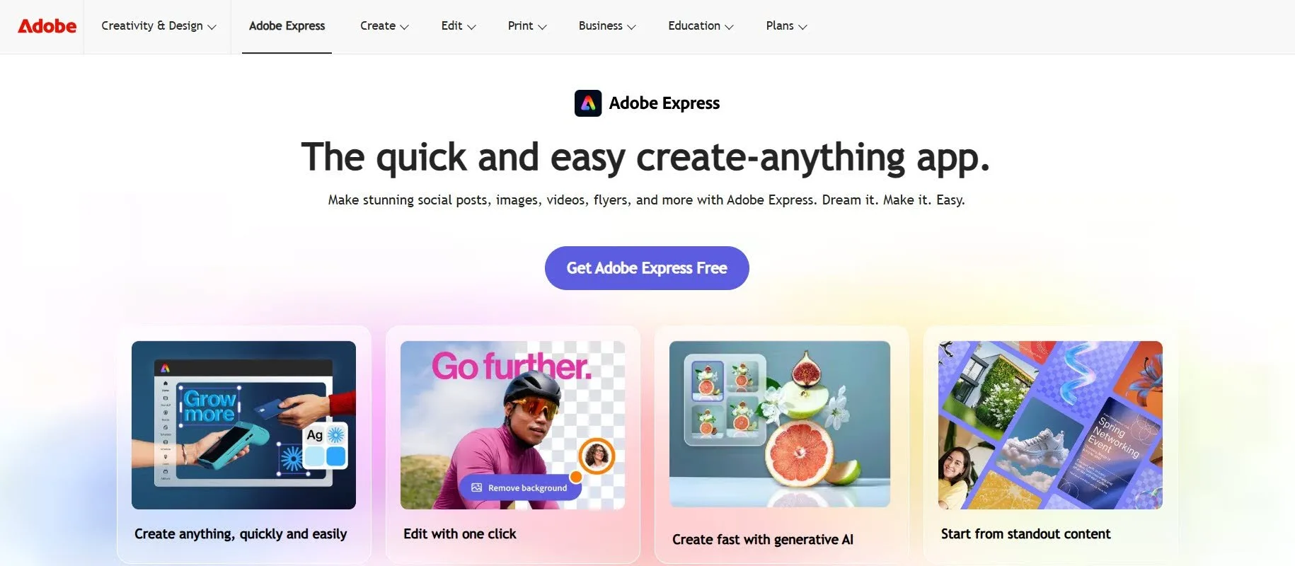
Adobe Express is useful when sourcing and creating visual assets normally takes up a substantial portion of infographic production.
Its broader creative environment combines templates, imagery, typography, design elements, and generative AI capabilities. That means creators can produce or modify supporting visual content without continually moving between separate applications.
The time-saving argument here is therefore less about automating an entire information-design process and more about consolidating creative tasks. For image-led infographics, promotional explainers, and visually rich marketing assets, having creation and editing capabilities in one environment can reduce the amount of asset preparation required before the final design comes together.
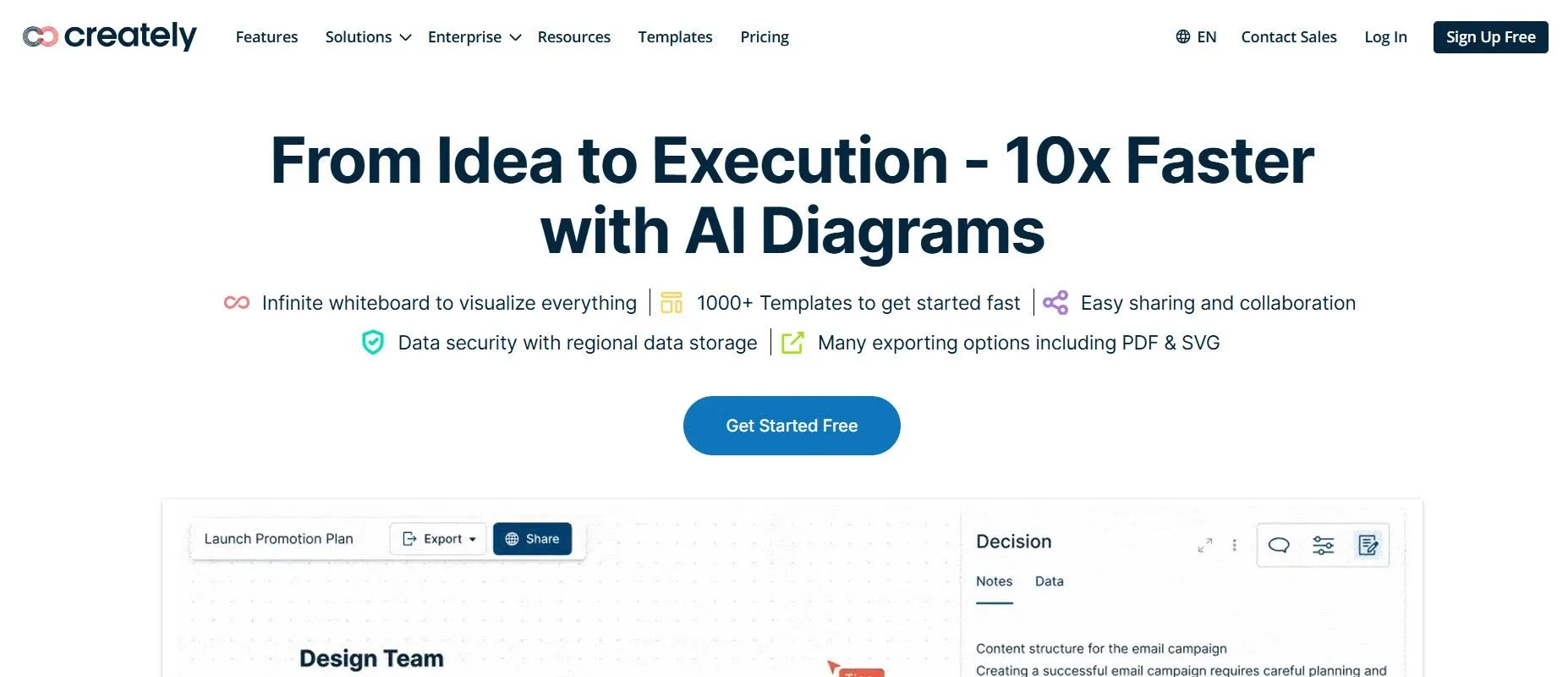
5. Creately: Best for Faster Process Mapping
- Founded: 2008
- Headquarters: Melbourne, Australia
Not every infographic begins with finished copy. Processes, systems, organizational structures, and workflows often need to be mapped before they can be presented clearly.
Creately approaches that problem from a diagramming and visual-collaboration perspective. Instead of manually arranging connected shapes and repeatedly adjusting relationships, teams can build information around structured diagrams and visual frameworks.
That makes the platform particularly relevant when the infographic’s underlying structure is the difficult part. For workflow diagrams, process explainers, and interconnected systems, reducing the time spent constructing and reorganizing relationships can matter more than generating decorative visual assets quickly.
6. Genially: Best for Faster Interactive Content

- Founded: 2015
- Headquarters: Córdoba, Spain
Interactive infographics traditionally require more production work than static designs because creators need to think about both the information and how audiences will explore it.
Genially brings interactive content creation into a visual editor, making it possible to build richer digital experiences without treating interactivity as a separate development project. This is particularly useful for training materials, educational content, explainers, and presentations.
For the right project, that can eliminate an entire additional production stage. Rather than designing a static infographic first and then handing it elsewhere to become interactive, creators can develop those behaviors as part of the visual itself.
Save Time Where It Actually Matters
The fastest infographic generator isn’t necessarily the one that produces a design first. Real efficiency comes from reducing work across the entire process: organizing information, building layouts, creating visualizations, applying branding, and handling revisions.
That’s why the right choice depends on where your own workflow slows down. AI generation can accelerate the first draft, while strong templates, data tools, reusable brand assets, or easier editing may save more time over repeated projects.
Choose a generator that removes the manual work your team encounters most often. That’s where automation stops being a novelty and starts becoming genuinely useful.