Your brand personality is the shorthand people use to remember you. It shapes first impressions, guides choices, and makes your design feel like it could only be yours. When your visuals match your voice, every touchpoint feels cohesive and intentional.
Think of design as behavior made visible. Colors, type, layout, and movement are all signals. When those signals are aligned with your values and audience, you increase trust, improve recognition, and make decisions faster across your team.
Define Your Brand Personality
Start by naming 3 to 5 traits that capture your brand at its best. Choose words your customers would actually use, not internal jargon. If your team debates the list, narrow it with real examples of brands you admire and why.
Turn traits into creative boundaries. For a brand that is bold, friendly, and practical, you might lean into larger headings, rounded shapes, and straightforward language. For a brand that is refined, curious, and confident, you might choose delicate details, generous white space, and measured pacing.
Document the implications. Write a short statement like a style oath so decisions stay consistent. Keep it visible where designers and writers work daily.
Choose A Core Visual System
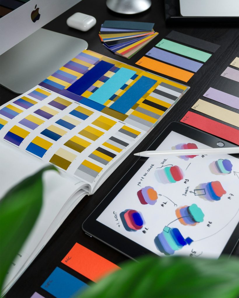
A visual system is the kit that keeps you consistent. It includes grids, spacing, color roles, type scales, icon rules, and patterns. When you define these pieces early, you reduce subjective debates later.
Give components clear jobs. Primary color drives actions, neutral tones carry content, and accent color highlights data. Set spacing tokens, define breakpoints, and pick a grid that supports your content patterns across screens and print.
Use a short checklist to pressure test your system:
- Does it scale from mobile to desktop to print without hacks
- Can a new teammate build a screen by following tokens and rules
- Do components support accessibility from the start
Typography That Matches Your Voice
Type is your brand’s voice made visible. Serif, sans, and display families each carry cultural signals that can reinforce your traits. When in doubt, build a pair: a confident display for headlines and a highly readable text face for body copy.
Choose families that remain legible at small sizes. Research the best fonts for business cards and test them in real contexts like email signatures, product UI, and printed packaging. This helps you see how they perform.
Establish a type scale that feels natural. Use consistent line height and letter spacing rules. Limit yourself to 2 families and 8 weights or fewer to keep performance and consistency in check.
Color With Meaning And Restraint
Color choices are never neutral. They carry cultural and emotional weight, so map your palette to the traits you defined. If you need energy, choose brighter hues. If you need calm, lower saturation, and increased contrast for clarity.
Define roles so color choices stay purposeful. Assign primary, secondary, background, surface, and states like success, warning, and error. Show examples of correct and incorrect use to reduce ambiguity.
Test color in grayscale to confirm hierarchy still reads. Check contrast with accessibility tools. Add rules for dark mode so your brand stays recognizable across themes.
Imagery And Illustration Style
Images are how you show your world, not just your product. Decide whether photography should feel candid or composed, bright or muted, busy or minimal. Create a mood board that locks the look before any shoot.
If you use illustration, pick a line weight, shape language, and perspective that match your personality. Friendly brands often use round shapes and soft corners, while technical brands lean on geometry and crisp edges.
Write do’s and don’ts that anyone can follow. Include guidance for cropping, backgrounds, and negative space. Specify when to use stock, when to commission, and how to keep visual metaphors simple.
Layout And Composition Principles
Layout guides the eye. Use a grid to create rhythm, align elements, and build hierarchy. Consistent spacing between modules is a small habit that makes everything feel intentional.
Lead with clarity. Each screen or page should have one obvious action or idea. Group related elements and reduce competing focal points so your message lands fast.
Balance personality with restraint. Add distinct flourishes sparingly so they feel like signatures rather than noise. Repetition creates familiarity, and a few well-placed surprises keep things memorable.
Motion And Microinteractions
Motion communicates cause and effect. A subtle fade can show hierarchy, while a quick slide can suggest momentum. Keep easing consistently so interactive moments feel like they belong to the same world.
Set a speed philosophy. A thoughtful brand might move more slowly with longer easing, while a sporty brand moves faster with snappier curves. Document durations for entrances, exits, and feedback states.
Use microinteractions to reward clarity. Buttons confirm actions, errors shake gently, and tooltips appear without blocking content. Motion should support comprehension first and flavor second.
Copywriting And Tone Alignment
Words carry your character. If your brand is practical, keep sentences short and verbs strong. If it is playful, allow light humor while staying clear.
Create a voice chart with examples. Show formal vs. casual, long vs. short, and specific vocabulary to use or avoid. Provide before-and-after samples so writers can mirror the tone.
Pair voice with visuals. A gentle color palette and calm motion call for measured language. A high-contrast palette and bold type suit more direct copy. Harmony across senses builds trust.
Accessibility And Inclusivity From The Start
Accessible design is brand-positive design. It increases reach, reduces risk, and makes your experience usable for everyone. Aim for solid contrast, clear hit targets, and keyboard-friendly navigation.
Design for diversity in imagery and language. Avoid idioms that exclude readers. Support multiple reading levels and provide alt text that adds value, not noise.
Bake tests into your workflow. Use automated checks, but rely on real users to find gaps. Track improvements like reduced error rates or increased task completion as proof that your inclusivity works.
Testing, Consistency, And Governance
Design improves with feedback. Run quick tests with real content, not lorem ipsum, so you catch issues earlier. Ask users to complete simple tasks and watch where they pause or backtrack.
Create a small governance loop so the system stays healthy:
- Appoint owners for type, color, and components
- Review new patterns on a monthly cadence
- Archive outdated assets to avoid drift
Measure consistency. Track reuse of components, time to ship, and defect rates. When numbers trend the right way, you know your system is working.

Your brand should feel like a person people want to spend time with. When your design system reflects that personality, every touchpoint becomes easier to make and nicer to use. Consistency is not sameness – it is coherence that frees you to be creative on purpose.
The payoff shows up in recognition, trust, and speed. Teams argue less and build more. Customers know it is you at a glance, and that familiarity turns into loyalty.

A dad of 3 kids and a keen writer covering a range of topics such as Internet marketing, SEO and more! When not writing, he’s found behind a drum kit.