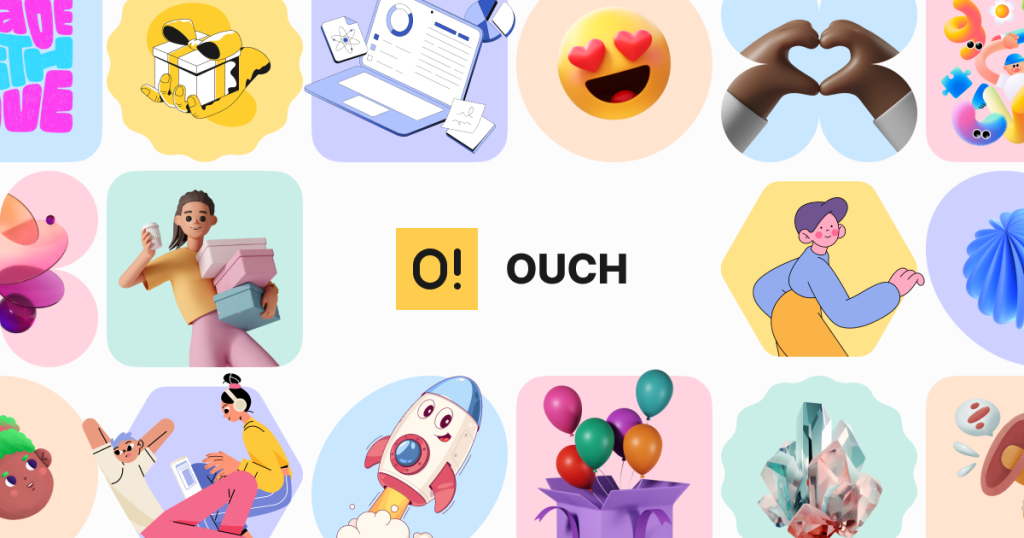
The last thing I needed was another graphics resource. My hard drive already groaned with underused subscriptions and half-forgotten design assets. Then, last September, during a particularly hellish project week, our junior designer Tom showed me something that actually changed my workflow: Ouch illustrations from Icons8.
Six months and seventeen projects later, I’m still using them weekly. This isn’t going to be one of those breathless reviews where I pretend something revolutionized the entire industry. But I will share why this particular resource has earned its keep in my professional toolkit when so many others got kicked to the digital curb.

What Actually Works in Real Projects
The true test of any design resource isn’t how it looks in carefully curated samples—it’s what happens when you try implementing it under deadline pressure with clients who change requirements hourly.
My first Ouch project was for a mental health app redesign that needed a complete visual overhaul in ten days. The client rejected our initial custom illustration concepts (too clinical), and we were scrambling. I pulled several illustrations from Ouch’s “Blush” collection, made quick color modifications to match the brand palette, and integrated them into the prototype.
The client actually smiled during the presentation. Two weeks later, they reported user feedback, specifically mentioning how the visuals made sensitive content feel more approachable. That’s not just aesthetic success—that’s functional communication.
What became clear through subsequent projects wasn’t just that these illustrations looked good—they worked well within actual design constraints:
- They scaled properly across device sizes without losing clarity
- They maintained visual coherence when modified for brand colors
- They integrated naturally with existing UI components
- They performed specific communication functions rather than just decorating
When designing interfaces professionally, these practical considerations matter far more than subjective artistic preferences.
Technical Aspects Worth Mentioning
After fifteen years of designing across print and digital, I’ve developed strong opinions about technical quality. Few things frustrate me more than beautiful assets that create implementation headaches.
Ouch has impressed me in several areas that directly impact workflow efficiency:
The multi-format availability actually works as advertised. SVG files maintain proper structure—I can modify colors and individual elements without everything falling apart. PNGs come with proper transparency. GIFs animate smoothly without weighing 20MB. This sounds basic, but I’ve been burned enough times by technically problematic files to appreciate when things just work.
The file organization also deserves praise. I recently had to find every illustration showing “teamwork” across multiple styles for a corporate intranet. The search functionality and category organization made this possible in minutes rather than hours.
My developer colleagues specifically appreciate the optimized file sizes and clean code. As Elena (our lead developer) put it during our last project review: “I didn’t have to fix anything before implementation. Do you know how rare that is?” That is high praise indeed from someone who usually grumbles about design assets.
Applications Across Professional Contexts
Different professional groups have distinct needs when it comes to visual resources. Based on collaborative projects over the past six months, I’ve observed specific use cases where Ouch particularly excels:
Web Design & UI/UX Implementation
The most immediate application I’ve found is addressing what I call “UI emotion gaps”—those moments when interfaces need to communicate emotional context that text alone handles poorly.
Error states provide the clearest example. On an e-commerce project last November, we replaced generic error messages with contextual illustrations and saw measurable improvements in recovery rates—users who encountered errors were 32% more likely to continue toward conversion rather than abandoning their carts.
The “empty state” illustrations have proven equally valuable. A dashboard redesign for a productivity app used illustrations to guide first-time users through the initial setup. The client reported that support tickets for basic orientation dropped dramatically after implementation.
Marketing Application Points
My marketing collaborators have found particularly strong results using these illustrations in email and social campaigns:
- Sequential storytelling across multi-touch campaigns
- Maintaining visual consistency across platforms with different constraints
- Creating visual distinctions between product lines or service categories
Megan, who handles content marketing for one of my SaaS clients, tracked significantly higher engagement metrics after implementing a consistent illustration system using Ouch assets. Her exact words: “People actually scroll all the way through now, and the click-through on our resource links jumped 24% last quarter.”
Their team now incorporates clip art from Ouch as foundational campaign elements rather than afterthoughts. This systematic approach has made their visual production more efficient while improving content performance metrics.
Developer Considerations
Designers often neglect to consider how our choices impact implementation workloads. Through several collaborative projects, I’ve gathered specific feedback from development teams about what makes these illustrations particularly implementation-friendly:
- Consistent naming conventions that facilitate programmatic handling
- Optimized file sizes that don’t create performance issues
- Clean code that doesn’t require extensive cleanup before deployment
During a recent healthcare portal project retrospective, our development lead specifically mentioned that the illustration implementation required approximately 40% less time than their previous experience with similar visual elements.
Educational Context Applications
The educational applications emerged unexpectedly through a side project designing learning modules for professional development training. Abstract concepts like “collaborative leadership” and “change management” proved difficult to visualize through photography but worked remarkably well through illustration.
Post-implementation surveys from learners specifically mentioned the visual elements as aids to comprehension and retention. One participant commented: “The visuals helped me actually remember the framework when I tried applying it later.”
For specialized subject matter, the ability to modify illustrations proved particularly valuable—we could adjust visual metaphors to more precisely match educational objectives without commissioning entirely custom artwork.
Small Business & Startup Value
For resource-constrained organizations I’ve worked with, Ouch offers particular advantages:
- Professional visual quality without specialized design staff
- Consistent brand visualization across touchpoints
- Rapid iteration capability without extensive design time
A bootstrapped fintech startup I advised was struggling with visual inconsistency across its marketing materials and product interfaces. Implementing a systematic approach using a single Ouch illustration style created immediate cohesion that noticeably elevated their perceived professionalism.
Their founder later mentioned that multiple investors commented positively on the improved design cohesion during their funding round presentations. That’s a tangible business impact beyond mere aesthetics.
Implementation Lessons From Mixed Results
Not every implementation succeeded equally well. Through both successes and failures, I’ve developed some practical guidelines:
Context appropriateness trumps personal preference. An illustration style I personally loved failed completely when implemented in a professional legal services portal. User feedback indicated the style felt too playful for serious subject matter. I’ve learned to rigorously evaluate stylistic fit for specific user contexts rather than defaulting to personal favorites.
Strategic placement matters enormously. A project where we initially placed illustrations on nearly every screen created visual noise that actually detracted from usability. Through testing and iteration, we found that focusing illustrations on specific moments in the user journey—particularly transitions, achievements, and potential points of confusion—yielded better results than ubiquitous implementation.
Consistency requires discipline. On projects with multiple designers selecting illustrations independently, visual coherence suffered noticeably. I now develop specific illustration guidelines at project initiation and maintain careful documentation of selected styles and implementation patterns.
Customization requires restraint. The ability to modify illustrations sometimes leads to over-customization that degrades the original quality. I’ve developed a “minimal effective modification” approach—changing only what’s necessary for brand alignment rather than rebuilding illustrations entirely.
These guidelines emerged from actual project outcomes, not theoretical preferences. The most successful implementations maintained strategic focus rather than treating illustrations as universal visual solutions.
Limitations Worth Acknowledging
Honest assessment requires acknowledging limitations I’ve encountered:
The popularity of certain styles has led to some recognition issues across projects. During a recent client presentation, a stakeholder noted they’d seen similar illustrations on a competitor’s website. This isn’t necessarily a problem, but it’s worth setting appropriate expectations about exclusivity.
Some highly specialized visualizations still require custom work. A medical device interface needed extremely specific anatomical illustrations that required commissioning custom artwork despite extensive searching through available options.
The customization capabilities, while robust, don’t replace the precision of truly custom illustrations for highly specialized needs. I still occasionally need fully bespoke visuals for certain projects, particularly when unique visual concepts are central to brand identity.
Value Assessment For Practical Implementation
After incorporating these illustrations across multiple projects spanning different industries and use cases, my value assessment considers both quality and practical implementation factors:
Compared to custom illustration: While custom illustration provides complete specificity, the time and budget requirements are often prohibitive for many projects. For roughly 80% of use cases I’ve encountered, Ouch provides effective solutions at a fraction of the time and cost of investment.
Compared to photography: Traditional stock photography often struggles with abstract concepts and maintaining visual consistency across diverse scenarios. Illustration has proven more adaptable for conceptual communication while maintaining stylistic coherence.
Compared to other illustration resources, The technical quality and implementation readiness distinguish Ouch from many alternatives I’ve used. The files simply work better in actual production environments with fewer technical issues.
Implementation Approach Recommendations
For those looking to implement these resources effectively in their own work, I’ve developed specific recommendations based on project type:
For digital product design: Focus illustrations at key moments in the user journey—particularly onboarding, empty states, achievements, and error conditions. Use them to clarify complex actions rather than merely decorating screens.
For marketing materials: Develop systematic approaches that maintain visual consistency across channels while using illustrations to differentiate between product categories or audience segments.
For educational content: Pair illustrations with conceptually challenging content to enhance comprehension and retention. Use visual metaphors to make abstract ideas more concrete and memorable.
For startup materials: Select a single illustration style aligned with brand personality, then implement it consistently across all touchpoints with particular attention to high-stakes communications like pitch materials and product demonstrations.
Conclusion: Practical Value Beyond Aesthetics
After implementing Ouch illustrations across dozens of professional projects, my assessment focuses on practical value rather than subjective visual appeal. The most compelling evidence comes from performance metrics—reduced support inquiries, improved completion rates, higher engagement statistics, and faster implementation times.
For designers, marketers, developers, and organizations navigating the challenges of creating effective visual communication with constrained resources, Ouch provides a solution that balances quality, practicality, and efficiency. It’s not just about making things look better—it’s about making them work better.
That’s ultimately why this particular resource has remained in my active toolkit when so many others have been abandoned. In a field where visual trends come and go with dizzying speed, practical effectiveness remains the most valuable currency.
Founder Dinis Guarda
IntelligentHQ Your New Business Network.
IntelligentHQ is a Business network and an expert source for finance, capital markets and intelligence for thousands of global business professionals, startups, and companies.
We exist at the point of intersection between technology, social media, finance and innovation.
IntelligentHQ leverages innovation and scale of social digital technology, analytics, news, and distribution to create an unparalleled, full digital medium and social business networks spectrum.
IntelligentHQ is working hard, to become a trusted, and indispensable source of business news and analytics, within financial services and its associated supply chains and ecosystems