


Over the past few decades much has changed in the global economy. There has been a massive push towards globalisation, and many more regions have opened up in terms of liberalisation of trade. Multinational companies have boomed. The GDP of some countries did really well out of this while others most certainly have not. Then again, some have really not changed their status much at all.
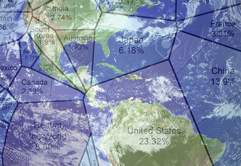
Raul from Howmuch.net (2015) describes how his team created a 20 second video to summarise 35 years of the world’s economy. Taking data from the International Monetary Fund, the video is a Voronoi diagram which demonstrates the GDP of different large countries in the world between 1980 and 2015. It is possible to watch the video and see how countries’ economies have grown or subsided when compared with others.
One should be aware though, that GDP, the metric used by the video to demonstrate growth is very controversial. GDP is said to measure income, but not equality, growth, but not destruction, and it ignores values like social cohesion and the environment.
Anyway the video can be interesting to watch. If one focuses on a particular region or country, one will notice that in many cases there is a period of relative expansion followed by relative contraction or vice versa. The example is provided of the United States which grew a lot until 1985, later sank back in the ten years up to 1995, and increased in size again up until reaching a peak in 2002. It then reverted back until 2009 and since then has maintained a degree of stability with 22% of the world’s GDP. One of the biggest trends the video shows is how over the past 35 years Asia gained economic dominance while Europe lost it. As explained, in 1980 Europe comprised more than 30 per cent of the global economic activity and Asia only 20 per cent, but in just over 30 years this situation had swapped entirely. Over the period, South American, African and Oceanian countries mostly experienced small increases in their economies, while in North America there was a decline. Asia is where the largest changes of all can be seen. In particular, it is pointed out that Japan’s economy contracted from 9.8% in 1980 to 6% in 2014. Other countries also grew tremendously in this region, particularly China, whose GDP rose to 13.4% in 2014 when compared with 2.8% of worldwide GDP in 1980. India, Taiwan, Russia and South Korea all saw very large increases.
Ups of Downs of The Economy
The diagram teaches us some interesting lessons. One of this is explained to be the fact that in the case of most countries, the economy is not a straight line of progress or decline. Many countries have experienced ups and downs as they head in a particular trajectory. The example of the USA has already been explained but Japan has also experienced somewhat of a roller coaster. Also the video shows that there can be waves that occur in the global economy as a result of one country’s activities. One of these that is perhaps unsurprising is the various recessions that the USA has faced. All of these can be seen to have had an impact elsewhere in the world. The economic downturn between 2007 and 2009 can be seen to have created the biggest wave. This was good for some, such as some places in Asia, but bad for some European economies.
Overall, some of the most important learnings include the fact that despite the US economy is not performing as well as it was, it is still the biggest dominant single economy. It comprises almost a quarter of global GDP (22.5%) which is the same as the share of Europe as a whole. Another interesting observation is that the Chinese economy has grown tremendously since 1980 and is now the second largest global economy today.
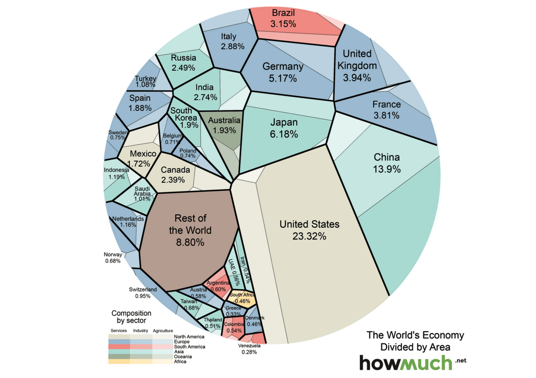
A third important finding is that Asia has completely traded places with Europe in terms of size and scale of its economy.
Overall, looking forward it is anticipated that the world’s economy will grow in the short term. Currently developed economies are thought to be growing faster and developing economies slower. Of course, situations can always change that, and there have been knock on effects of problems in the Chinese economy that if had been mapped on the diagram would most likely show considerable waves around the world too. It is yet to be seen what the full impact of these waves will be.

IntelligentHQ Your New Business Network.
IntelligentHQ is a Business network and an expert source for finance, capital markets and intelligence for thousands of global business professionals, startups, and companies.
We exist at the point of intersection between technology, social media, finance and innovation.
IntelligentHQ leverages innovation and scale of social digital technology, analytics, news and distribution to create an unparalleled, full digital medium and social business network spectrum.
IntelligentHQ is working hard, to become a trusted, and indispensable source of business news and analytics, within financial services and its associated supply chains and ecosystems.