


Email accessibility is the most discussed topic at all digital and email marketing summits.
Most of us have never thought of those who cannot hear and see. Do you know that 4.5 % of your subscribers have special needs? And they want to be able to read your emails, too!
So let’s talk about accessibility in email marketing. This is a must today because of the three reasons:
- To abide by current legislation;
- To increase your income by 8%;
- To show care about your clients.
Just imagine: 285 million people worldwide have visual impairments even when wearing glasses. This makes more than half of the EU population or 87% of the USA population.
And 5% worldwide (over 360 million) have hearing impairments.
In this post, we’re gonna reveal email accessibility best practices and ways of implementing them by using email templates provided by the best email editors.
What is accessibility in email marketing and how to make your emails accessible?
Blindness and other visual impairments require using screen reading programs like VoiceOver (Mac), Microsoft Narrator (Windows), TalkBack (Android), etc.
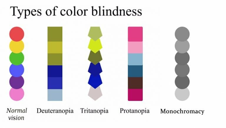
As for color blindness — there are people who don’t distinguish red and green (protanopia) or even cannot differentiate colors at all, only the shades of gray (monochromacy).
So how can we improve emails accessibility? Let’s take a look at email accessibility standards and some practices to code emails of this type.
Email accessibility requirements
This is a set of rules and standards to compose emails that will be easy-to-read for people who suffer from visual or hearing impairments.
1. Requirements for color blindness
There are a few types of color blindness.
Protanopia is a reduced sensitivity to red and its shades. Red-blind people often confuse black and many shades of red, dark/light brown and dark/light green (respectively) and shades of blue and red.
Deuteranopia is a reduced sensitivity to green. Green-blind people also tend to confuse mid red and green, bright green and bright yellow, light blue and lilac.
Tritanopia is characterized by an inaccurate perception of blue. People who suffer from tritanopia confuse light blue and grey, dark purple and black.
Monochromacy is a complete color blindness. Sufferers see only shades of grey from black to white.
Ways to improve email accessibility:
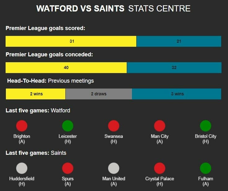
➢ don’t use green and red as contrast colors. Don’t set green to text font placed over a red background, or vice versa. Same about all the colors those people tend to confuse;
➢ always specify apparel’s color in brackets — people might be aware that red flatters them;
 (original email)
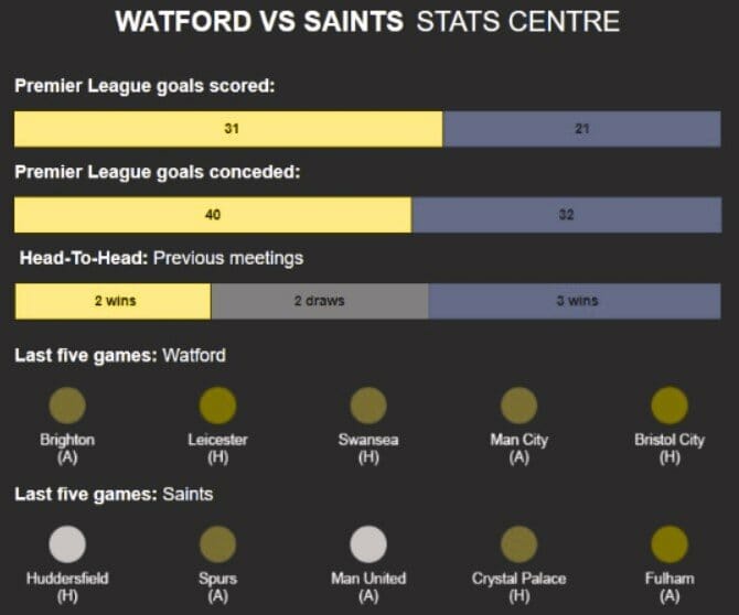
(the way red-blind people see this email)
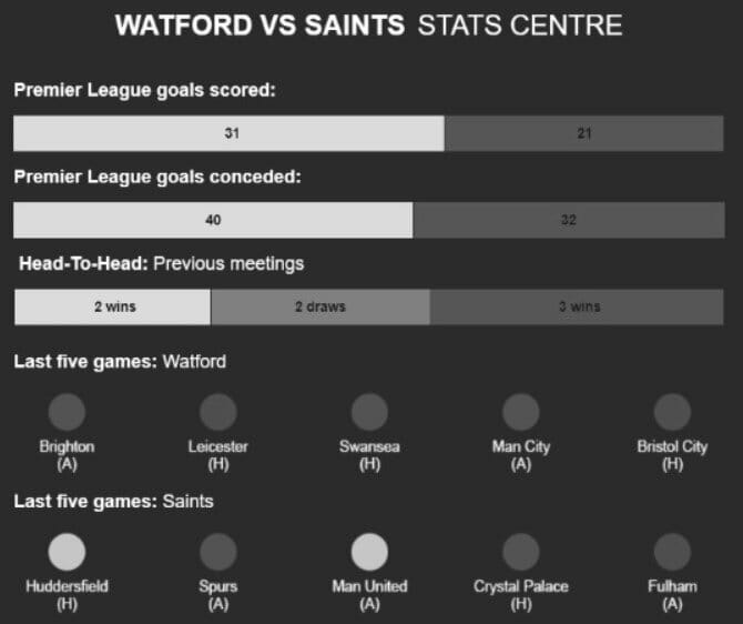
(the way monochromatic people see this email)
If this company had added words like “won” and “lost” under the teams, it would have been much easier for color blind people to find out whether their team won or lost;
➢ never apply green CTA buttons to red images and vice versa;

(original email)

(the same email through color blond people’s eyes)
➢ always write links in bold. It’s not enough to make them blue. This trick actually works not only for color blind people. When reading emails on smartphones and tablets outside, people may not differentiate colors if the sun is shining onto the screen. And avoid underlining links as it may confuse dyslexic readers. It’s preferable to write menu items in bold, too;
➢ if you use interactive elements (like rollovers) to run quizzes in emails and decide to highlight correct answers with green and incorrect with red — be sure to indicate if the answer is correct with words also.
 (example by HubSpot)
Please, take a look at this table of color perception by colorblind people :
It’s crucial to use this tool, which is totally free btw, to see the emails through the colorblind people’s eyes.
2. Requirements for blindness
The situation with total color blindness is absolutely different as blind people use screen readers.
We need to create emails that are legible for these assets.
Subject lines
A subject line is the first thing a screen reader reads. Make it as concise and descriptive as possible — in fact, it reflects the main idea of the email.
Language settings
Try to listen to some messages by means of any screen reader (I tried 3 ones). It was pretty stressful.
How it works: the screen reader speaks the language a blind person has set as a default one. And if this person receives a message that is written in another language, the software reads everything in a horrible way (transliteration). To make sure your emails will be read correctly, in its code set the language you write your email in.
Right at the beginning of the email, insert:
<html lang=“en”>
(This email accessibility practice works best for bi-or multilingual countries).
Encoding characters
The Content-Type determines the way an email will be displayed on recipients’ screens. Add <charset=”UTF-8″> in HTML code right after “<head>” as this is the most popular charset, it supports most of the characters.
Some modern email builders like Stripo already have set this Content Type in their email templates.
Logical order
When designing and styling text, use tags <h1>, <h2>, etc. as they have an advantage over <p> for a screen reader. Even if your font size is 32px or more, the copy wrapped in tags <h1> or <h2> will be read first.
Alt text
Screen readers cannot “read” images in emails. But they are capable of reading their “alt text”. So make it clear and informative.
Note: do not use the word “image” in the alt text, as its tags already contain it. A blind person when listening to this email will hear the word “image” twice.
Note: when adding a GIF that shows recipients how to use your product, provide them with a detailed textual manual under the GIF or at least add a link that will take customers to your website landing page.
Links
Links are supposed to be meaningful. Make the links text clear and informative!
Just compare:
The first link doesn’t contain any specific information, while the second one has details in it.
The way screenreaders read links:
We tested different emails on various screen readers in many languages, here are the results:
➢ Windows OS does not “read” or even mention links at all;
➢ Macintosh VoiceOver reads entire links with all their “https”;
➢ Android TalkBack doesn’t read links but says “Link — tap twice to open it”.
CTA buttons
The main mission of email marketing is selling. And CTA buttons are very supportive. Some designers try their hardest to make the button design bright and noticeable.
Therefore, email accessibility best practices show that engaging text is more valuable.
Most recipients see the button the way you designed it, but a screen reader sees only the copy of the button.
Social icons
Recipients who suffer for blindness do not see the icons. Take care about the alt text for them, too.
3. Requirements for dyslexia
Dyslexic readers have troubles with reading — they tend to confuse the order of letters in words despite normal intelligence.

(the same sentence the way dyslexic readers see it)
How can we improve email accessibility?
British Dyslexia Association offers a detailed guideline on how to create websites, blog posts and books.
Their recommendations:
➢ never underline the links, but make them bold;
➢ a new sentence in email starts on a new line;
➢ no CAPS LOCK. Want to emphasize something — just increase the font size;
➢ only left-aligned text (even in greeting cards);
➢ make background cream — never let it be white;
➢ end all sentences with a period (.) and end bullet points with full stops or semicolons.
4. Requirements for deafness
There is only one email accessibility requirement: under the videos where you explain how to use/install your product with voice, add captions or subtitles.
And never rely on Youtube subtitles as they sometimes mishear words.
(For fun, try to listen to your fav TC show with subtitles on).
Summing up
Email accessibility standards:
➢ the font size in emails should be at least 14px to provide its legibility, but 16px is better ;
➢ always check email accessibility with color blindness simulator and a screen reader (better with a few);
➢ use contrast colors of different shades;
➢ make a subject line reflect the email content;
➢ always add alt text to every image, GIF and social networks icons;
➢ if your GIF is educative, add a written detailed description;
➢ let your emails speak only one language;
➢ all the links in emails are to be meaningful;
➢ specify the Content-Type, preferably <charset=“UTF-8″>, to make all characters legible;
➢ apply only left alignment to text in emails.
And, of course, make your emails with love and care for everyone.
Stick to all these email accessibility guidelines — and you will succeed to create beautiful emails all your clients will be able to read!
This is an article provided by our partners network. It might not necessarily reflect the views or opinions of our editorial team and management.
Contributed content
Founder Dinis Guarda
IntelligentHQ Your New Business Network.
IntelligentHQ is a Business network and an expert source for finance, capital markets and intelligence for thousands of global business professionals, startups, and companies.
We exist at the point of intersection between technology, social media, finance and innovation.
IntelligentHQ leverages innovation and scale of social digital technology, analytics, news and distribution to create an unparalleled, full digital medium and social business network spectrum.
IntelligentHQ is working hard, to become a trusted, and indispensable source of business news and analytics, within financial services and its associated supply chains and ecosystems.