


One of the proven ways to generate more user engagement and increase your reach on social media is by using visuals and graphics to emphasise your posts. Posts with graphics or images are shared up to three times more often than posts without them. Graphics also have higher stopping power than text, so they allow your posts to capture the interest of more viewers.
You can dig deeper and fine-tune your social media visuals to produce the maximum impact. Simply adding images to your posts wouldn’t work. There are many things you can do to maximize the effectiveness of graphics on your social media pages. We are going to review the best tips and tricks to use in this article.
Design for an Audience
One of the things that make social media so effective as a digital marketing instrument is the fact that you can target a very specific audience segment on social media platforms. The detailed level of targeting also enables businesses and brands to engage the right audience segment and generate more leads from their social media activities.
The same approach works with the design and graphics you use to accentuate your posts. Not all audience groups love bright colour or vivid photos, which is why this type of graphics doesn’t always work for every brand. Some viewers prefer simpler, more minimalistic designs. Others love a certain tone and mood in photos and they react better when they see them.
Designing for an audience is a must. The process begins with taking the time to understand the audience. You can use the target audience of your social media pages as a benchmark or turn to the metrics you already have from the existing followers. The more you understand your audience, the better your designs will be.
Consider Readability
Despite the different nature of social media platforms, one thing remains the same: people scan through social media posts rather than read them carefully. This means you only have a split second to capture the attention of the audience.
Forget about long copy and small fonts. Legibility must always be your primary concern when designing for social media, regardless of the social media site you are designing for. Use big and simple fonts to maximize readability. Go straight to the call to action or key message to stop viewers in their tracks. More importantly, avoid elements that make the graphics difficult to scan.
Decorative fonts and fancy typefaces are common, but clean text remains the most effective tool for effective social media posts. For this reason, if you want great results in your marketing campaign, consult a professional such as the web design and marketing agency designbypelling.co.uk. This agency in Surrey can design your website and help out with graphic design to ensure everything that represents your brand stands out. Their reach is global so no matter whether you’re based in Surrey (or even the UK), they can still assist you.
Have a Structure
Just like how good articles are structured in a certain way, good graphics also require proper structure based on the goals they want to achieve. It is called visual hierarchy, the process of combining design elements like texts, colours, composition, and other elements to create a smooth flow in a design. With careful planning, it is easy to create a good hierarchy that really plays to the audience’s interests.
For example, using a big and clean typeface near the top of the image to convey a keyword, and then adding smaller text that contains a slightly longer description or message creates a flow that the audience can follow. This flow can be further fine-tuned using colours and design elements. Using colours that produce a more balanced contrast is another good example of how structure can alter the effectiveness of social media graphics.
Most viewers read from top to bottom and left to right, so you need to structure your images accordingly. The same can be done with photos. There are composition principles like the rule of thirds and leading lines that can help direct focus to a particular – important – part of the image.
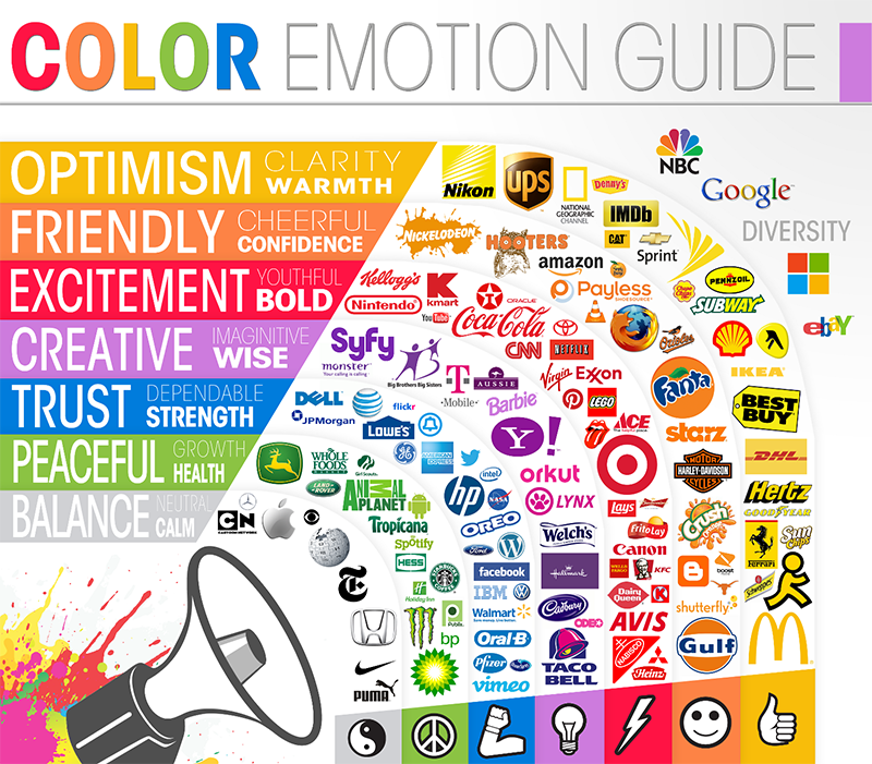
Mind the Colours
Last but certainly not least, you want to use colours to your advantage rather than the opposite. Colours combined in a certain way can make a graphic look special. The wrong colours mixed in a bad way, on the other hand, will bury your key messages and render the graphics utterly ineffective.
There are colours that don’t work with each other. Adding grey text on top of a bright red shape creates something called visual vibration. The same visual vibration appears when you combine bright orange with green and other colours that don’t work together. The image will be too uncomfortable to see.
On the other hand, some colours work really well together. Adding dark text to a light, slightly muted background is a great way to direct focus to the text. Sticking with analogous colours – colours that are close to each other on the colour wheel – is also a safe way to maintain a good balance in contrast. Combined with the previous tips we covered in this article, creating effective social media graphics is not difficult at all.
Founder Dinis Guarda
IntelligentHQ Your New Business Network.
IntelligentHQ is a Business network and an expert source for finance, capital markets and intelligence for thousands of global business professionals, startups, and companies.
We exist at the point of intersection between technology, social media, finance and innovation.
IntelligentHQ leverages innovation and scale of social digital technology, analytics, news, and distribution to create an unparalleled, full digital medium and social business networks spectrum.
IntelligentHQ is working hard, to become a trusted, and indispensable source of business news and analytics, within financial services and its associated supply chains and ecosystems