Top 7 Mainframe Modernization Vendors for Healthcare & Life Sciences A.Peyman Khosravani 28 April 2026
Leveling Up Security: How Gaming Fraud Detection Stops Bonus Abuse and Multi-Accounting A.Peyman Khosravani 28 March 2026
How to Turn Supplier Contract Reviews Into Faster, Data-Driven Decisions A.Peyman Khosravani 24 March 2026
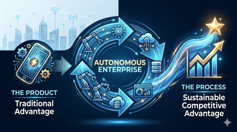
The Autonomous Enterprise: Why Your Next Competitive Advantage Won’t Be a Product, It Will Be a Process? A.Peyman Khosravani 24 March 2026
Why Data-Led Pricing Strategy Is Becoming Essential for Growth Teams A.Peyman Khosravani 23 March 2026
Sergio P. Mendes on How Data Is Changing the Role of Finance in Modern Companies A.Peyman Khosravani 19 March 2026
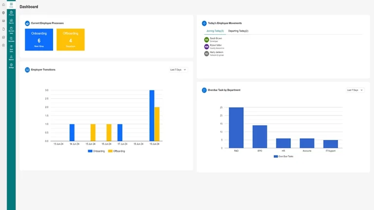
The Ultimate Guide to the Human Resources Onboarding Software at the Companies A.Peyman Khosravani 19 March 2026
How Advanced Inspection Technologies Are Transforming Industrial Safety and Maintenance A.Peyman Khosravani 4 March 2026
Why Tracking Near Misses Is Just as Important as Reporting Accidents A.Peyman Khosravani 23 February 2026
Why is Data-Driven Forecasting the New Standard for Cold Chain Reliability? A.Peyman Khosravani 20 February 2026
Why Different Education Records Require Different Redaction Techniques Pallavi Singal 17 February 2026
From Data Loss to Downtime: The Hidden Costs of Power Interruptions for Modern Enterprises A.Peyman Khosravani 28 January 2026