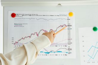
Open any brokerage app, and the first thing you’ll see is a chart. Most people accept whichever format the platform defaults to. They never ask whether a different view might answer their question better or whether the format they’re staring at is actively hiding information they need.
A stock market graph is not just decoration on a trading screen. It’s how price data gets translated into visual information you can act on. But the translation changes depending on which chart type you use, and each format makes deliberate trade-offs between simplicity and depth.
How Line Charts Simplify the Picture (Sometimes Too Much)
The line chart is where most new investors start, and there’s a reason for that. It’s the least intimidating format available. One continuous line connecting closing prices across time. Nothing else is competing for attention. No visual noise.
That clarity has genuine value when you need a quick answer to a basic question. Has this stock been trending up or down over the past year? A line chart on any stock market graph platform tells you instantly. No interpretation required.
But here’s the trade-off. By showing only the close, a line chart strips away everything that happened during the session. Two stocks could close at the same price on a given day while having completely different experiences. One might have traded in a tight range. The other might have swung 6% before settling back. The line chart makes those two days indistinguishable.
That limitation matters less for someone reviewing a 10-year trajectory. It matters enormously for anyone using a stock market graph to evaluate recent behavior or time an entry.
What Bar Charts Reveal That Line Charts Cannot
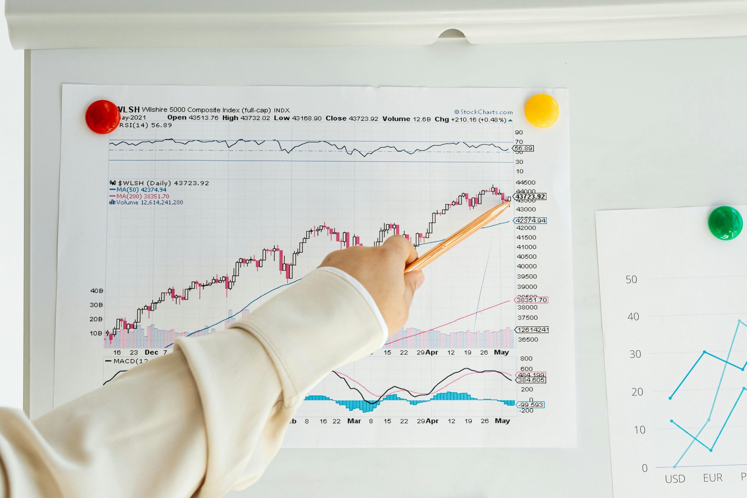
Bar charts were the professional standard for decades before candlesticks displaced them. Each vertical bar captures four distinct pieces of information: opening price, session high, session low, and closing price.
A small horizontal tick on the left marks the open. Another on the right marks the close. The full height of the bar shows the session’s range. On a stock market graph using bars, tall bars indicate aggressive activity while short compressed bars suggest neither buyers nor sellers are committed with conviction.
This is substantially more informative than a line chart. You’re seeing the full range of the battle between buyers and sellers, not just the outcome.
The downside is visual density. Pull back to view three or six months on a bar-based stock market graph, and the display becomes cluttered. The small ticks blur together, and scanning for patterns gets harder, especially on mobile platforms where most retail investors now monitor positions.
Where Candlestick Charts Earn Their Dominance
Candlesticks carry the exact same data as bar charts, open, high, low, and close, but restructure the visual presentation in a way that makes price action far more immediate.
The wide body of each candle represents the gap between open and close. Color distinguishes direction: green (or hollow) means the session closed higher than it opened, red (or filled) means it closed lower. The thin wicks above and below extend to the session high and low.
What this achieves on a stock market graph is something bar charts never managed: instant pattern recognition across extended timeframes. You can scan six months of data and immediately identify clusters of buying pressure, selling exhaustion, and reversal signals without squinting at tiny tick marks.
The depth goes further. Candlestick patterns, such as doji, hammer, engulfing, and morning star, have been studied for centuries, originating in Japanese rice markets. Each reflects a specific shift in buyer-seller psychology. A hammer after a prolonged decline suggests sellers drove prices lower, but buyers stepped in aggressively before the close. That’s visible instantly on a candlestick stock market graph. On a bar chart, you’d study each bar individually to extract the same insight.
| Feature | Line | Bar | Candlestick | Area |
| Data points shown | Close only | Open, high, low, close | Open, high, low, close | Close only |
| Pattern recognition | Limited | Moderate | Strong | Limited |
| Visual clarity at scale | Excellent | Poor | Good | Good |
| Intraday detail | None | Full | Full (color-coded) | None |
| Best suited for | Long-term trend overview | Detailed session analysis | Momentum and reversal detection | Visualizing cumulative movement |
Area Charts: The Format Nobody Talks About But Everyone Has Seen
Area charts are essentially line charts with the space beneath the line filled with color or shading. Functionally, they show the exact same single data point, the closing price, and carry the same limitations.
So why do they even exist as a separate category?
Presentation. The filled area creates a stronger visual impression of cumulative movement. On a stock market graph, an area chart makes gains and losses feel more tangible. The rising and falling “mountain” communicates momentum intuitively for audiences who aren’t trained chart readers.
Financial media uses them frequently for exactly this reason. For analytical purposes, though, they add nothing a line chart doesn’t provide. The visual weight of shading can actually create false significance; a gradual decline looks more dramatic as a shrinking mountain than as a sloping line.
Area charts have their place in reports and investor presentations. They don’t belong in your analytical workflow.
Conclusion
Each stock market graph format exists because it solves a specific visual problem. Line and area charts trade detail for clarity. Bar charts deliver complete session data but sacrifice readability at scale. Candlesticks balance depth and visual clarity better than any alternative, which is why they’ve become the default across nearly every serious trading and investing platform.
The chart type you choose should match the question you’re asking. Use line charts for the broad view. Switch to candlesticks for pattern recognition, timing, or understanding the session-level battle between buyers and sellers. That flexibility, knowing when to use what, is a skill most investors never develop.