


Data and statistics tend to bore most people, since no one really enjoys staring at a chart of numbers, unless those numbers have been created by you. But pictures help to transform our data into meaningful images that are easy to interpret and give us some insight and what the list of useless numbers is really saying.
Remember when you were a kid and reading picture books was okay? Turns out that this style of learning is extremely effective. In a 1986 study at the University of Minnesota School of Management, it was found that when a visual aid was used, presenters were 43% more effective in persuading audience members. Why is does the image have that much of an impact?
According to Mike Parkinson of Billion Dollar Graphics, it’s because graphics do when text cannot: They affect us cognitively and emotionally.
Cognitively, they increase our level of communication through an elevated level of comprehension, recollection and retention. Additionally, the visual cues allow us to pair ideas with images so we can better remember them. Emotionally, picture amplify our emotions and attitudes, engage our imagination with an increased level of creative thinking. This results in a more accurate understanding of content when the emotional part of the brain is activated.
Infographics have become a new way to present information for people to easily understand it. An infographic is a visual representation of information, data or knowledge that’s intended to present complex information quickly and clearly. Why do they work so well? Because they enhance the human visual system’s ability to see patterns and trends in things. When someone creates an infographic, it’s often referred to as data visualization, information design or information architecture. Either way, it’s pretty much creating adult picture books.
Inspire Trends has a list of the Top 10 Free Data Visualization Tools. Some are useful, while others are strictly for fun and procrastinating. The creators of the tools say it’s aimed to support users to get good structured and easy understandable overviews of topics they’re researching. The browser is a modified version of the GNU GPL licensed Flash browser for FreeMind.
1. Tag Galaxy
Tag Galaxy is an interactive data visualization tool that allows you to enter different hashtag subjects on Flickr and find the most trending topics that contain those hashtags. Once you combine a couple of different topics and their are no more related tags, it compiles a collection of photos that have recently been posted on Flickr and are related to the different topics. Below, I’ve combined social media, Facebook, Twitter and Flickr.
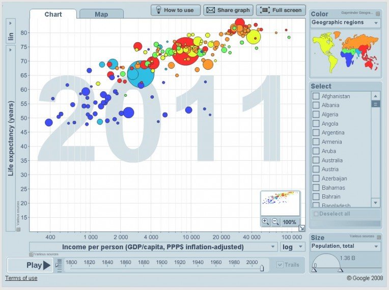
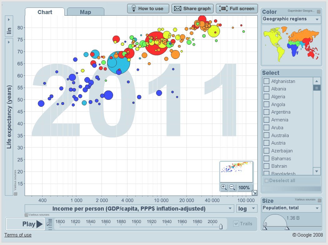
2. Gapminder
The mission of Gapminder Foundation is to fight devastating ignorance with a fact-based worldview that everyone can understand. Gapminder was founded by Professor Hans Rosling, from Karolinska Institute in Stockholm in 2005.
Since then, Gapminder has visualized lots of different data and presented it to lots of different people. Gapminder uses beautiful dynamic infographics to inform people about to increase the use and understanding of statistics and provide information about social, economic and environmental development at local, national and global levels.
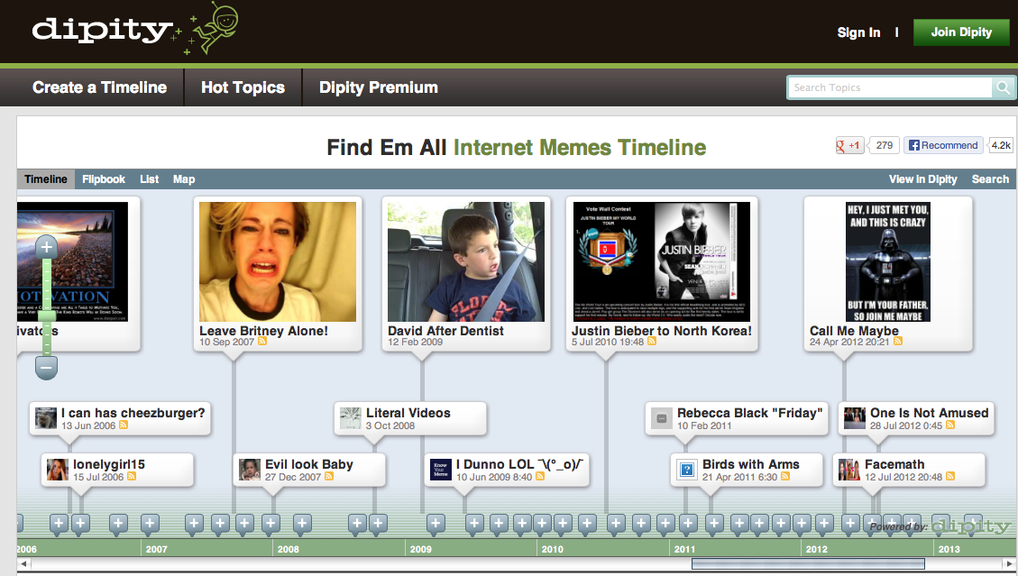
3. Dipity
Dipity is a free digital timeline website that has the mission to organize content on the web in an easy-to-use, chronological timeline. Users have the ability to create, share, embed and collaborate on interactive timelines that use files in the form of video, audio, images, text, links, social media links, GPS location and timestamps.
Dipity is designed for anyone who is interested about specific subjects on the Internet. It could be extremely useful for Newspaper, journalists, bloggers, politicians, financial institutions, universities, teachers and students. Digital timelines are a great way to increase the traffic and engagement of a website and brings a visual representation of topics that are harder to digest.
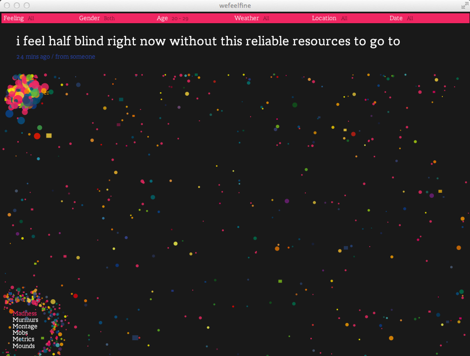
4. WeFeelFine
This interesting site is based on discovery and sparking emotions. It gives you a universe if little colorful dots bouncing around, almost like the millions of cells inside your body, rapidly shaking or ricocheting off one another. Each cell has a tag that’s shown when you place your mouse over it. Once you click on it, it shows you a quote from someone that justifies whatever emotion their feelings.
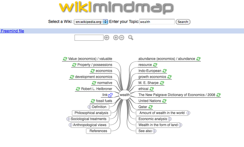
5. WikiMindMap
Wonder what how many different directions a topic can go? WikiMindMap allows users to take any topic and search it in wikipedia. The result is a map showing every topic connected. It’s designed to allow users to browse easily and efficiently through the content in Wikipedia. It’s inspired by the mindmap technique and the complexity of Wikipedia’s enormous database and documents.
The application also allows you to sort the cells by gender, feelings, age, weather, location and date. This application is great for just finding motivation, expressing your feelings, and discovering the ways other interpret theirs.
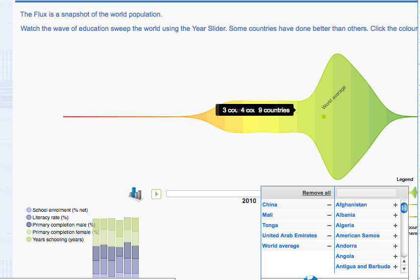
6. BetterWorldFlux
This visualization tool is interactive and present users with the information that really matters in life. It visually communicates the world state in terms of living and quality of life for many countries and how it constantly changes. The tool is designed to build a consensus, tell a story and share it and raise awareness for the UN Millennium Development Goals.
The right hand bar has several different indicators that will show you data about them when you drag them up to the bar. Some of the indicators are access to water, child mortality rates, happiness scores, life expectancy, literacy rate, ratio of girls and boys education and percent of tuberculosis. Then you select the countries you want to see the information on, or just use the world average. Finally, the bar under the graphic allows you to see the information up to 50 years prior.
7. Data Journalism
This site, created by Stanford University, gives a video report on data visualization as a storytelling medium. It contains 54 minutes of information and provides links and data along the way.
On the right hand bar, a description of each video is provided that gives you the basic overview of what will be talked about. Key points are also provided so you can quickly get the gist, and a comments section is provided so you can interact with other users.
8. Data Stories
Data Stories is a bi-weekly podcast about data visualization hosted by Enrico Bertini and Moritz Stefaner. They have guests talking about visualization and give overviews of non-standard devices and environments.
In this most recent chapter (#26), they cover the topics of display walls, surfaces, tabletops, and people collaborating around them. The bottom of the website provides an extensive list of links and sources from where they derived their information from, as well as a detailed itinerary of their web program.
9. TimeFlow
This is a visualization tool for temporal data. The current release is a very early version and may have some bugs and glitches, but for the most part it works pretty fine. The tool is designed to help you analyze temporal data in five different ways: Timelines, calendars, bar charts, tables and lists.
10. Here Is Today
Here is today is a very simple, fun tool that puts time in perspective for you. It gives you a visual representation of every single unit of time you progress through in your life, and many that you don’t. It starts with a box that says “Here is today”, followed by a box that says “here is this month”, making todays box 1/30th the size of the months (obviously).

IntelligentHQ Your New Business Network.
IntelligentHQ is a Business network and an expert source for finance, capital markets and intelligence for thousands of global business professionals, startups, and companies.
We exist at the point of intersection between technology, social media, finance and innovation.
IntelligentHQ leverages innovation and scale of social digital technology, analytics, news and distribution to create an unparalleled, full digital medium and social business network spectrum.
IntelligentHQ is working hard, to become a trusted, and indispensable source of business news and analytics, within financial services and its associated supply chains and ecosystems.